Color of the Year: How to Use It in Every Room
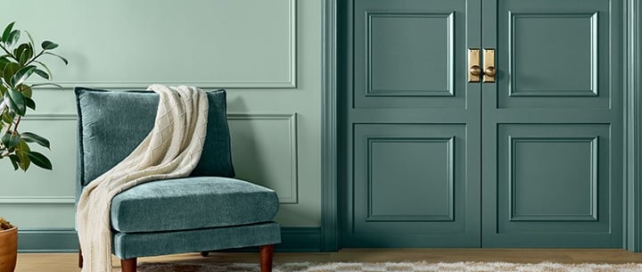
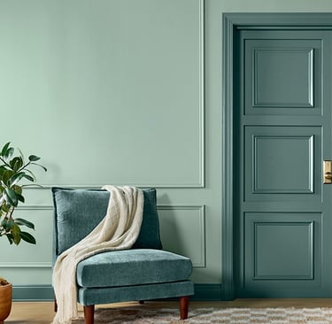
Each year, color enthusiasts and design lovers eagerly await the announcement of the Color of the Year, and for 2025, Sherwin-Williams has chosen “Quietude” (SW 6212) — a soft, serene blue-green that perfectly balances tranquility and sophistication. It's a hue that whispers calm and encourages stillness, making it ideal for the modern home where wellness and style go hand in hand.
3/1/20253 min read
Whether you're ready for a full home makeover or just looking for subtle updates, here’s how to incorporate Quietude into every room of your home.
🛋️ Living Room
The living room is the heart of the home — a space for gathering, relaxing, and entertaining. Quietude makes for a refreshing yet calming wall color, offering a serene backdrop that feels both airy and grounded.
How to use it:
Paint all walls in Quietude for a spa-like vibe.
Pair with natural textures like rattan, oak, or linen to enhance its earthy undertone.
Accent with warm whites, soft grays, and brushed brass to create a cozy yet sophisticated palette.
Bonus tip: If you’re not ready to commit to painting all four walls, try Quietude on a single accent wall or above wainscoting for subtle elegance.
🛏️ Bedroom
Bedrooms are our personal sanctuaries — and Quietude is practically made for them. Its blend of blue and green evokes a sense of stillness and deep rest.
How to use it:
Paint the walls or just the wall behind your bed for a calming focal point.
Mix in soft, textured bedding in creams and ivories.
Use black metal accents for contrast without overwhelming the peaceful tone.
Mood enhancer: Add sheer white curtains that let in soft natural light to maximize the tranquil effect of this color.
🛁 Bathroom
Bathrooms are increasingly designed as places for rejuvenation, and Quietude brings just the right touch of spa-inspired serenity.
How to use it:
Paint walls or cabinetry in Quietude for a clean and peaceful look.
Pair with white or marble tile, matte black fixtures, and light wood elements for a modern spa aesthetic.
Add eucalyptus sprigs, white towels, and woven baskets to enhance the experience.
This shade can transform even a small powder room into a space that feels elevated and intentional.
🍽️ Dining Room
The dining room doesn’t always get the attention it deserves, but using Quietude here can make it feel both elegant and inviting — perfect for lingering meals and meaningful conversations.
How to use it:
Paint the walls or just the upper half above molding.
Pair with deep wood furniture, amber glassware, or antique gold light fixtures for a warm, moody contrast.
Add velvet or linen dining chair cushions in complementary tones like muted mauve or warm gray.
Quietude has a unique ability to bring depth without overwhelming — exactly what you want for a sophisticated dining atmosphere.
🍳 Kitchen
In a space often filled with energy and movement, Quietude brings a surprising calmness to the kitchen. It softens the utilitarian vibe while still feeling fresh and clean.
How to use it:
Paint lower cabinets in Quietude and pair with white uppers for a modern two-tone look.
Use as a backsplash color (through tile or painted beadboard).
Complement with brass hardware, white quartz countertops, and open shelving to keep things light and airy.
Quietude works wonderfully in both modern farmhouse and coastal-inspired kitchens.
🧸 Kids’ Room or Nursery
Quietude’s softness makes it ideal for children’s spaces where peace and comfort are key. It’s also a perfect gender-neutral alternative to traditional pastels.
How to use it:
Use on walls, furniture (like a crib or dresser), or even as a ceiling color.
Mix with white, beige, or terracotta for a playful yet grounded palette.
Add whimsical touches like nature-themed decals, cloud mobiles, or soft plush decor.
Quietude evolves well with age, making it a long-term win for a child’s room.
Final Thoughts
Sherwin-Williams’ 2025 Color of the Year, Quietude, lives up to its name. It’s a graceful, versatile hue that promotes calm and connection in every corner of your home. Whether you're embracing it boldly or sprinkling it in through accents, this peaceful blue-green has the power to create spaces that feel beautiful, balanced, and deeply livable.
So go ahead—let your home breathe a little quieter this year.
Inspiration
Explore decor ideas for every room in home.
© 2025. All rights reserved.
Some of the links on this website are affiliate links. This means that if you click on a link and make a purchase, I may earn a small commission at no additional cost to you.
I only recommend products and services that I genuinely love, use, or believe will add value to my readers. This helps support the blog and allows me to continue creating helpful content—thank you for your support!
As an Amazon Associate, I earn from qualifying purchases.